Friday 18 October 2013

Ink Splatter tags

On AFTCM, the latest theme for the October tags is Ink Splatters.

I thought that White glossy paper would work best for this technique so I cut some tag shapes from it.

For the first tag and for the first one I used alcohol inks.

I dropped the inks on the cardstock then used compressed air to blow them around. The can was running out so I didn't achieve the same effect that Tim does when he demonstrates this technique, however, I am happy with it.

Using Rangers Pitch Black archival ink, I stamped the Graphics 45 stamps on the tag. On a scrap piece of cardstock I stamped the PSX sentiment and attached it with double-sided foam tape.

I outlined the edges of the tag with a red marker and attached some foil trim to the top. And of course, added a red reinforcement to the hole and strung some cording through it.

For the second tag, I decided to use the Rangers (Tim Holtz) Distress Stains to create the ink splatters. I just thumped each colour down on the cardstock and they spread nicely.

I stamped the Hero Arts stamp with archival ink then added the Magenta stamp at the bottom using the same ink. I coloured  a piece of scrap cardstock with yellow dye ink, stamped the Hero Arts flower and cut it out. I attached this by the bird with double-sided foam tape.

I outlined the edges with a black marker then added a green metallic reinforcement to the hole and attached the black and silver fibres.


Colour Perceptions ATC

For the month of  October the colour is Blue and must be predominately that colour. Inspiration/theme is based on and emotion/how the colour us makes us feel.

I think of blue as a calm colour so that is the emotion/perception that my ATC evolved around. 

I started by stamping a Stampscapes stamp with Marvy dark blue ink.  I coloured the sky and river with copic markers. 

On a piece of cardstock, I stamped the Marks of Distinction swans in fluid chalk Prussian Blue then coloured the water below them in chalks. I cut them out and attached them at the bottom of the card. 

To make the river look more realistic I covered it with Glossy Accents. 

Shabby Chic' Tags

 On AFTCM we did a swap in September with the theme Shabby Chic' with a clay embellishment.

For the first tag I stamped a Hero Arts harlequin stamp on white cardstock with white pigment ink. I coloured over it with Clearsnap Shabby Chic' pigment inks in 3 different colours using a stylus and foam tip.

I punched some flower shapes from scrapbook paper with text on it and glued them together. I added some air dried clay circles to the centres, which I had stamped texture on and coloured with Mica Magic inks.

I outlined the edges with a coordinating coloured marker and attached lace to left-hand side and fibres to the top.

On the second tag I stamped a Penny Black floral stamp in white pigment ink and embossed it with white embossing powder. I coloured over it with the Shabby Chic pigment inks. 

I added a piece of a doily at the bottom and some text scrapbook paper on the right, and coloured them with the pigment inks. I added a string of pearls and some lace. 

I applied some Vintage Photo distress ink around the edges of the tag to add some depth.

The air dried clay piece was coloured with distress paint and attached near the bottom.

Due to a slight mix up on the group, I sent the tags to the wrong person so I made two more tags for the correct partner. 

On the first of the new tags, I coloured the tag with the Shabby Chic pigment inks the Stamp Smoosh technique, and a colorbox stylus and foam tip. 

I stamped the image by Rubber Stampede in Rangers Black archival ink.

Took some Tim Holtz tissue tape, coloured it with the pigment inks and attached it on the lower portion of the tag and added lace above and below it. I glued the clay flower in place with some glue.

I coloured scraps of white cardstock with the pigment inks and punched out a small circle, then punched a hole in the centre. Stamped over this with a text stamp and Tsukineko Memento Tuxedo Black ink. I placed this over the hole at the top of the tag as a reinforcement.

The second tag may actually look more vintage than Shabby Chic, so hope my partner will like it anyway.

I coloured the white tag with the Shabby Chic pigment inks, sandwiched it between two pieces of newsprint to heat set it. Stamped around the tag with a clear Magenta stamp.

I coloured a piece of white lace with Lavendar fluid chalk ink, heat set it the same way as the tag and attached it at the bottom.

I die cut a Memory Box Palace Oval frame, covered it with clear embossing ink and embossed it with Silver embossing powder, added some clear UTEE and let it cool. I went over it with some black acrylic paint then wiped it off.

I printed an image from Elizabeth's blog  and die cut it using the same die. I inserted the picture in the middle of the die-cut and attached it to the tag.

I glued a piece of velvet ribbon over the lace, attached some pearls and the clay piece which I adorned with some little gems. Must admit that the more I look at my "clay piece", I am thinking it might be a UTEE piece, so if it is hope my partner doesn't mind the substitution!!


Colour Perceptions ATC

Green is the colour for September ArtVentures Colour Perceptions ATC swap.

The colour green makes me think of nature and how every colour is harmonious with it, so that was my emotion/perception for this month.

I started with white cardstock and a Hero Arts flower stamp and used Cathie Allan's "Stamp Smoosh" technique with Olive Fluid chalk.

I stamped the Paper Parachute floral stamp with green pigment ink and Judikins Forest twinkle embossing powder. I used this stamp as there is a negative side to the stamp and the original background showed through.

To add some more detail I covered a piece of white cardstock with aquamarine fluid chalk, stamped a text stamp in green pigment ink and embossed it with clear embossing powder. I attached this to the right-hand side of the ATC.

Colour Perceptions ATC

The colour Yellow was the one for the month of August in the ArtVentures ongoing colour perceptions  ATC swap.

To me, yellow is a happy colour, so I decided to build my ATC on that theme.

The base was a light yellow cardstock. I took another piece of darker yellow cardstock, punched a fancy circle in it then stamped a floral background over it.

I stamped the little bear by Little Suzy's Zoo on some white cardstock, coloured it with Copic markers and  coloured the background with some Vivid yellow ink. I glued it behind the punched piece of cardstock and adhered it to the base.

Using a Martha Stewart border punch I punched out two different shades of yellow and glued them to the bottom. I then stamped the sentiment and glued it to the top.

Colour Perceptions ATC

On ArtVentures we are continuing on with the  swap theme "colour perceptions", with each month being a different colour. For the month of  July the colour is Orange and must be predominately that colour. Inspiration/theme is based on and emotion/how the colour us makes us feel.

I chose to colour the base with some light orange ink, stamped a Magenta background stamp in permanent ink. I  stamped a saying in permanent ink on some orange tissue paper and glued it to the background.

To complete it, I added an orange flower, a little butterfly coloured in another shade of orange and some verigated rick-rack.

The colour orange  made me think of  pleasure.


Sunday 30 June 2013

Close To My Heart Blog Hop

I am participating in a blog hop for Kat who is starting out with CTMH products. If you are interested in purchasing the products and don't have a local dealer please visit
http://katancheta.ctmh.com/

For my projects I used the Pinwheel stamp set and some of the Reflections Dream Pop papers.

My first project is a card for my Son's birthday next month. I started by colouring a piece of white cardstock with various colours of pigment inks, then stamped some stars at the top with Alabaster fluid chalk ink. I outlined the edges with a black marker then attached it to a piece of grey cardstock with a clear resist pattern printed on it and layered it on a piece of black cardstock.

I stamped the small pinwheels on a piece of the Reflections Dream Pop  patterned paper with a black stamp pad, cut them out and added a brad to the centre. I stamped the little "stick" to add to the pinwheels.

I printed a picture of my son, outlined it with the black marker and adhered it to the front panel. and attached the pinwheels. I attached a strip of the grey resist cardstock at the bottom. Stamped the sentiment and coloured the stars with a glitter gel pen and attached it with double-sided foam tape.
To complete the card I stamped two stars and coloured them with the gel pen.


I decided to do a second project using a canvas. I started by finding a picture that I liked which is a freebie from a blog and based the colour palette on the picture.

I painted the canvas with different shades of purple acrylics and added a bit of white acrylic around it. When dry I placed a stencil on the canvas and added molding paste, and coloured it with Smooch ink. When it dried, added the picture with gel medium underneath and over the top and framed it with the little stamped pieces from the pinwheel set.

When looking at the stamp set, I thought that the little pinwheels could be used as flowers. So I stamped several in different colours, cut them out and layered them and attached a button. I added some embossing powder to the edges to give it some dimension. I cut out the sentiment from another piece of Reflections Dream Pop  patterned paper and glued it to the bottom and added the flowers around the picture.


I decided to do one more project using all the lovely decorative papers and settled on a file folder book. I used several different papers and sentiments. I also made tags from the scraps.


On the front I used the Tim Holtz die to make the little Rosette with one of the papers that was really colourful.


Of course there will be prizes to be won by leaving a comment on the posts.  

Lets get this hop started! Below are the links to each designers‘ blogs. If you get lost along the way- just come back here: 


Thursday 13 June 2013

Colour Perceptions Artist Trading Card

On ArtVentures we are starting a new ongoing swap theme "colour perceptions", with each month being a different colour. For this we must think layers of the colour and must be  predominatelythe colour for that month. Inspiration/theme is based on and emotion/how the colour us makes us feel,

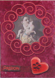
For this month the colour is red, and this colour made me think of love and passion.

I took a piece of glossy white cardstock and coloured it with Sangria Piñata Alcohol Ink and pounced it on with Caro extender and a felt pad.

I coloured some white cardstock with Lipstick Red Fluid Chalks then cut out the Memory Box curly wreath. I had printed off some pictures of lovers previously so I also cut them out with the die and placed it in the centre of the curly wreath on the ATC.

I punched some heart from 130LB cardstock and layered 3 together to give them some body, and coloured them with a red marker. I melted some clear UTEE and added some garnet Heat-it-Inks, dipped the hearts in it and when dry added a little flower gem.

I attached a piece of Sookwang tape to the bottom of the ATC and covered it with Fire Red and burnished it and attached the heart to the side.

I coloured some white cardstock with Red Pepper Adirondack ink and stamped the PSX Pixie Expressions stamp in Versfine Onyx Black and attached it to the glitter piece with double-sided foam tape.

Altered Pringles Can

On AFTCM we did a swap where we altered a Pringles potato chip can with a steampunk theme.

For mine I covered the can with some scrapbook paper. For the top portion I embossed some flashing tape then added some alcohol inks to give it some color.

 I had some Graphics 45 steampunk papers and cut out several images and attached them with double- sided foam tape. I added some tiny roses to the two ladies heads.

Glued some cogs, a watch face and some other items around the can. Stamped a ticket and a sentiment and attached it.


I covered the lid with the same scrapbook paper that I had used to cover the can.

I had discovered a video on Youtube using the Tim Holtz movers and shapers mini clock die ( sorry can't find the link right now) and decided that I would do a steampunk version to put on top of the lid.
I cut the die 6 times out of some medium weight chip board then painted the outside portion black. Colored the hands with a silver paint pen and embossed the "bells", top and legs with copper embossing powder.

I cut the legs off two of the pieces and sandwiched them in the middle. I inserted a piece of acrylic and some scrapbook paper behind the front piece and another piece of acrylic and a pocket watch face on the back piece. Then I glued them all together. I added some tiny cogs on the outside of the front. I glued a large cog to to a piece of popsicle stick then atached the clock. I then added some large gears to hide it and help keep it in place and finished it with a couple of gold dewdrops on the side.


Tags with UTEE

Been a while since I posted anything as I had a busy couple of months. Recently on AFTCM we did some tags using the same image and UTEE (Ultra thick embossing powder).

I had recenty printed off an image from Elizabeth's blog which really appealed to me and I decided to use them for my tags.

For the first one I colored the background with fluid chalk inks, stamped a floral stamp and Tim Holtz script stamp in a darker colour, then adhered the image to the tag.

I cut out a frame and covered it with white UTEE then sprinkled on platinum UTEE and some queen's gold embossing powder, heated it till it was "liquid" then stamped into it with a Magenta background stamp.

I stamped and embossed the Magenta sentiment then coloured it with fluid chalk inks and buffed it to remove the ink from the embossed area.

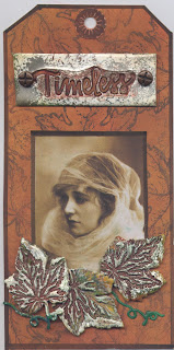
 On the second tag I coloured the background with pigment inks then stamped a PSX Maple Leaf stamp in black. Attached a smaller version of the image. It then cut out some Cuttlebug leaf dies and glued three together, added white UTEE on top and a couple of other colours of embossing powder heated it and stamped into it with a maple leaft stamp. Ahered these to the tag with double-sided foam tape.

I cut another piece of cardstock, and again applied white UTEE and sprinkled some Platinum UTEE over it heat it and stamped the Hero Arts sentiment with the dark pigment ink while hot. I attached the screw brads, then adhered it to the tag with double-sided foam tape.


Tuesday 26 March 2013

File Folder book

On AFTCM we are doing a swap where you use an 8 ½" x 11" file folder and turn it into a book.

I had originally started making one with a butterfly/garden theme, but after receiving my partner's name I decided she might not like that so I made another one for her.

In my stash  I had some beautiful double-sided Bo Bunny black and white scrapbook paper and that was my jumping off point for the book.

I took a manila file folder and folded it  using a tutorial by splitcoast stampers. I coloured the edges of each portion of the page and the tabs with Blackbird fluid chalk ink. I cut the scrapbook papers to fit both the inside of the pockets and the folded edges, alternating the colours to create contrast and adhered them in place.

On the back I used the same paper on each end and some Bazil script paper.

The travel theme evolved when I was looking through my stamps and came across three that fit a French theme.  From there I remembered my set of PSX Pixie Expressions which have several travel sentiments.

On the book cover, the Inkadinkado Eiffel Tower is done on acetate and embossed with pewter embossing powder, with a piece of cardstock coloured and attached behind to make the word "Paris" more visible. I added a touch of colour to the Paper Inspirations Tender Embrace image just to add a little accent and match the acetate piece.

I added various travel themed items on the bottom portions of the folder. A hero arts stamp with International landmarks, the Pixie Expressions sentiments,  Stampers Anonymous (Tim Holtz) sentiment and  little antique car and Autumn Leaves clear stamps set of Arrows.

For the tags I continued with the travel theme and did a collage on each tag.

For the first one I used an ocean cruise theme, using the Shipboard Crossing stamp by Rubber stampede, Now Boarding by Inkadinkado, Stampers Anonymous (Tim Holtz) ticket and sentiment, and more of the Pixie Expressions. To complete it I outlined the tag with a black marker.

Tag 2:  I stamped the Inkadinkado Envelope stamp and the Hero Arts Skyland stamps, masked them and stamped the Stampers Anonymous (Tim Holtz) script stamp over portions of the tag, then added the city names with another Stampers Anonymous Tim Holtz stamp.  I stamped and embossed the ticket and antique car (Stampers Anonymous (Tim Holtz) ) and the Inkadinkado camera. cut them out and adhered them to the tag. To complete it I outlined the tag with a black marker.

Tag 3: I stamped the PSX World Traveler, added the birds  by Stampers Anonymous (Tim Holtz) and a couple of the Pixie Expressions sentiments. To complete it I outlined the tag with a black marker.

For the last tag, I stamped a train stamp, masked it and stamped a Stampers Anonymous (Tim Holtz) background over it. I stamped the Impression Obsession Eiffel Tower over the top of the background. Stamped and embossed the Stampers Anonymous (Tim Holtz) film strip, cut it out and attached to the bottom of the tag.

Altered Alphabet

Another swap on AFTCM is to alter an alphabet letter representing the first letter of our partners name.

My partner's given name starts with the letter L and she likes vintage, Victorian, lace and filigree .

I took several pieces of chipboard, cut them out in an L shape and glued them together. I covered the piece with some script scrapbook paper.  I had some large pieces of lace and glued it to the bottom of the L shape then sprayed the whole thing with some Dylusions Melted Chocolate spray and some glimmer mist.

I felt like it need something on the left hand side so I attached some wood scroll pieces to the edge after painting them with a deep red and brown acrylic paint. I also sprayed some roses and daisy flowers with the Dylusions spray, and attached them at the bottom left corner along with a leaf and a broken piece from a broach (which is the closest thing I had to filigree!).

I wanted some texture so I added some Stampendous Ancient Wine embossing enamel at the top, edges and on a few areas of the scrolls.

I coloured two little ceramic pieces with Smooch gold and attached them above the flowers along with a home made hat pin and an old safety pin. I layered two Memory Box bird house dies together and put it at the top with foam tape underneath to raise it a bit. I added an old earring at the top which looks like grapes; added a little bird cut from some scrapbook paper. I had a stamped butterfly on my desk so I glued it in with the flowers, then added a little bottle cap with the letter L imprinted on it.

On  the bottom I added the wood embellishment with the word Dream on which I had embossed the edges with the Stampendous enamel; added a little screw brad to it. I coloured two little dragonflies with permanent ink pens and Smooch Ink, removed the backs and glued them beside the wooden embellishment. The last step was to add tiny gems scattered throughout.

Thursday 14 March 2013

Playing around with 3-D Mbossabilities

I received a bunch of supplies that I had ordered and one of the items was the new 3-D Mbossabilities by Spellbinders. So instead of working on one of my swaps that I am trying to decide on a theme, I played with the embossing folder.

I came across my Radiant Pearls paints that I have not used in a long time and sadly these beautiful paints are no longer available. I painted the whole surface with these paints except for the banner which I covered with Bisque Fluid Chalk ink then highlighted with the Creamy Brown Fluid Chalk ink. 

I then went over the whole piece with the Creamy Brown and distressed the edges with Vintage photo Distress ink. The sparkle of the Radiant Pearls still shows underneath the fluid chalks. I stamped the sentiment with Memento Ink. 

I think I will be playing more with this embossing folder using different supplies.


Altered CD

For the month of March we are doing an Altered CD on AMCA with the theme of Vintage Women.

 I took some scrapbook paper and cut it to size and adhered it to the CD with some YES glue. I then stamped a script stamp with a second generation of Memory Brown ink.

I stamped the image of the Eiffel Tower in the same colour of ink and coloured the Paris portion with a Tombow marker. I wanted it to be more dimensional so I stamped and embossed it again on some acetate and attached it to the CD with Glossy Accents.

I dabbed some clear embossing ink around the edge of the CD and covered it with Stampendous Aged Wine Embossing Enamel and heat set it.

I attached the image from Moonlight Journey to a scrap piece of cardstock and cut it out and adhered it with some double-sided foam carpet tape.

I had some flowers (which are actually sticker like things for a lap top) and coloured them with some Inka Gold and glued them to the right of the image. To complete it I added the clock charm.

The piece you see jutting out at the bottom is an easel that I made from cardstock so the CD can be put on display if the recipient should desire.


Thursday 7 March 2013

Annette's having a giveaway

Annette is giving away some lovely Mica Pigment powders by Luminarte. Even if you don't want to enter to win, I would recommend you visit Annette's blog as there are so many beautiful pieces of art that she has created.

Tuesday 5 March 2013

A-Z techniques Z For Zig-Zag

We are finally at the end of the alphabets for the A to Z techniques in ArtVentures.

The only Z techniques I could think of were Zentangles and Zetiology, but I don't really enjoy  doodling unless I happen to be on the phone and then I sometimes doodle.

I decided to do a zig-zag pattern using coloured text weight papers that I had on my table. I cut them into strips (trying to make sure they were all the same width), then braided them together. When each piece was long enough I glued them to an ATC blank.

I then cut out a frame from some coordinating coloured cardstock and stamped a line of Z's around the perimeter and embossed it with Queens Gold embossing powder.  I attached the frame to the base with Sookwang tape.

I then took some chipboard letters and embossed them with Stampendous Embossing Enamel. I used Aged Wine and Aged Rose. I was thinking of adding some other embellishments but decided against it.

I also decided to try another way of doing the Zig-Zag pattern and experimented with a photo corner stamp. I used pigment ink and stamped it in two different colours across the base, then embossed with clear embossing powder.

Monday 4 March 2013

A-Z techniques Yellow Melted Crayons

We are now up to Y on the ArtVentures A to Z techniques.

This round I decided to do a wax crayon background and was going to do the usual technique where you rub the crayons on a hot iron then onto the cardstock. To be honest I am not crazy about that method as you have to be sure to clean the iron thoroughly in case you need to iron clothes and the dyes seem to be hard to remove.

While browsing for something else I came across a tutorial for the crayon background which is incredibly easy.

I cut a piece of wax paper large enough to fold over the ATC blank. I placed the cardstock piece on it using a crayon sharpener, shaved several shades of yellow crayons, including a pearlized one on to the ATC. I then sprinkled some Sunflower Yellow Perfect Pearls on top.

I folded the wax paper over the top and heated it till the wax paper and crayons melted. While heating it I moved the cardstock around so the wax spread.  I used a scrap of folded cardstock and pushed it over the top of the wax paper to  move the wax into areas where there were gaps. The Perfect Pearls add a nice dimension to the background.

I stamped a large Hero Arts Y stamp on embossable acetate and embossed it with black embossing powder, then cut it out leaving a small halo so the embossing doesn't rub off.  Rather than leaving it clear I stamped the embossed side with clear embossing powder, added Stamp and Stick embossing powder, (this is a sticky embossing powder which acts like a glue) then added Yellow Glitter Ritz. I adhered this to the background with some Judikins Diamond Glaze.

I then stamped a Stampendous Image on the acetate and coloured the embossed side with markers, cut it out and attached it beside the Y with the Diamond Glaze. The stamp is actually Queen Ann's Lace but I am calling it Yarrow for this technique as it looks close enough!!

To complete the ATC I added a little gem embellishment to the Alphabet.

This ATC is Y for Yellow Melted Crayon with Sunflower Yellow Perfect Pearls and Yarrow.


Wednesday 13 February 2013

A to Z Techniques- X for X-Acto Cutwork

The latest letter for the A-Z techniques is X. I thought of doing something like an X-Ray type background, but two other people are going in that direction. I even spent  time looking at websites and books, but there are very few techniques that start with the letter X, so I wracked my brain to come up with something else.

First I stamped a stained glass stamp on white card stock cut to size. I took a sharp X-Acto knife and started cutting out areas on the stamped image, being careful that they did not join, as the piece would come apart. After I was satisfied with the "cut-work" I cut some sheets of Sookwang tape to size and attached it to the ATC base. I removed the tape cover sheet from the ATC base and very carefully attached the cut-work image to it. This was definitely the hardest part, as the tape grabs fast and I ended up having to redo a couple as I got them on the base a bit "wonky".

I then used different colours of Stampa Rosa Ultra Glitter on the pieces. I covered the centre area with the tape backing and covered the cutouts with one colour, rubbing it in, then brushed it off to remove the excess, then added the second colour. The reason I chose to use this particular glitter is because the colour palette is so vibrant.

The last addition was to stamp a tiny X and attach it in the corner.

Stains and Dry Embossed Tags

On AFTCM we are doing a swap using some type of stains and dry embossing.

For my first one I dabbed Distress Stains across the page then spritzed some water over them. It did not blend as well as I would have liked but still happy with it. I then ran it through one of the Texture Fades embossing folders (clock faces). Added some script with a Tim Holtz stamp.

 I had a little image from moonlightjourney.com sitting on my desk so I added a page pebble over it and placed on one of the embossed clocks.

I took some grunge board letters and did Tim's technique where you put the Rock Candy Crackle Distress paint on the surface and allow it to dry, then add different colours of stains. I attached them to the tag with some Glossy Accents. I had another stamped piece on my desk from a Magenta (Crafty Individuals) stamp that I liked so I added it to the bottom of the tag.

The second tag was also using Distress Stains with Tim's technique were you apply Picket Fences stain on a mat and add various colours of stains around it then drag the tag through it. For some reason this did not turn out the way it did when I took his Chemistry 101 class, so I am thinking it may be the tag I used, which did not seem to let the colours blend together. However, I am pleased with the end result as it has a bit of a shabby look to the background.

I stamped this tag with a Hero Arts stamp then lined up the matching embossing folder and put it through the embossing machine. I added more colour to some of the flowers with Distress markers, and used a glitter gel pen to colour the centres.

I stamped a Tim Holtz stamp on a piece of scrap paper coloured with the stamps and inserted inside the embossed area. To finish it I added a little butterfly die (which I received from a friend), ran it through an embossing folder and added a piece of wire to simulate the antennas. I used the same gel pen to highlight the embossing on the butterfly.

Tuesday 5 February 2013

Artist Trading Cards

These two ATC's were ones I was really pleased with for the Mad Crafters Attic swaps.

The first one was the theme of triangles. I had some pieces of embossed cardstock that I had put aside from another project. I cut them into triangles and coloured them with different colours of pigment ink and embossed them with clear embossing powder and then rubbed them with dye ink pads to hit the high spots.

I attached three of them to the ATC Lumiere paint background. I stamped two words with dye inks matching the colours of the background and adhered them to the ATC.
The second one was Time Flies. I had recently bought the Tim Holtz Movers and Shapers Alarm Clock and Camera mini Dies, so this was the perfect opportunity to use the clock die.

I cut the die out of grunge board then coloured it with black acrylic and copper paints. I had some clock faces already printed and one was the perfect size to fit in the die. I cut a circle out of acetate and attached it over the clock face and laid all the pieces aside.

I had some Tim Holtz grunge board pieces in my stash and found some wings. I coloured them first with Frost White daubber paint, let it dry, then added the Pearl dauber paint over the top. I manipulated the wings so they fit nicely under the clock and attached both pieces with Glossy Accents. To finish the piece I used my labler to print Tempus Fugit, which is Time Flees in Latin or as in todays world Time Flies.

Poets ATC

On A Mad Crafters Attic we are doing an ongoing swap featuring a poet. For this month the poet is Maya Angelou and the interpretation of the theme is up to us.

The first poem that came to mind was A Caged Bird, but I think it would be a popular one so I chose "Touched by an Angel". I started with a background that I made with various colours of Lumiere paints and attached a picture of Maya Angelou. Then I stamped a coloured a little Magenta Angel and attached it to the card just barely touching the picture, then added a die cut star. To complete it I added her name and the name of the poem.

Altered Book

One of the latest swaps on AFTCM was to alter a book with drawers with the theme "Romantic Era".

I had a bunch of empty matchboxes on hand so I used them for the drawers.

The hardest part of this project was cutting and gluing the pages for the little drawers. I made four niches and used four of the little match boxes to which I attached tassels with heart shaped brads.

I also decorated a few pages at the front of the book and left some blank for the recipient to alter. I painted the whole book with black acrylic ink.

For the book cover I took a piece of 130 LB cardstock and did the stamp smoosh technique with reds, blues and pink pigment inks. I then added various colours of Opal embossing powders and then some blue iridescent pearl embossing powder, heated well and stamped over it with my favourite Hero Arts Flourish stamp.
I added a picture of a couple from Lisa Vollrath, which I printed in black and white and coloured with artist grade chalks. I covered the picture with some acetate and then added lace around the outside and some gold rose trim on the inside edge.
The little shoe is a charm that I had in my stash and coloured with permanent markers. I thought it was a perfect addition to the cover. I added it over some netting and a decorated hat pin.

To complete the book I coloured some chipboard letters and spelled out romantic on the spine.

A to Z Techniques W for Walnut Distress

For the  W I found a technique using walnut inks and decided to try it. Not sure where I found it  and not sure what is was called so I have given it my own name.

I started with watercolour paper sprayed with water and applied Tsukineko Walnut ink Spray over the surface. Then I dabbed clear embossing ink over the top and sprinkled on Distress embossing powder.

The instructions said to add Sparkle Pro Copper but I have no idea what it is so I used an artist grade copper mica powder and sprinkled it randomly over the surface and spritzed the ATC with water. I heat set it then removed some of the embossing powder to let the walnut ink show through.

I added a picture of a woman (moonlightjourney.com) on each one layered on a glittered punched circle. and then attached some words on each corner. Each one is a bit different as I am out of ink in my printer and used what I had printed previously.


A to Z techniques- V for Vellum-tous

A- to Z on Art-Ventures I used a technique that I learned from Cathie Allan a number of years ago called Vellum-tous.

The technique was originally done on a card but it worked for the ATC.
I cut a piece of White vellum a bit larger than the ATC base and stamped and embossed an open image with white pigment ink and embossing powder. I coloured the image with markers on the front of the vellum,  colouring the portions that I wished to be dominant.

I flipped the vellum over and took a  background stamp and stamped it with with a clear embossing pad and embossed with clear embossing powder. Make sure you hold the vellum up while heating, as the embossing on the other side gets hot and melts.

Using a stipple brush and dye ink colours I stippled around the stamped image on the back of the vellum. If you also want to colour the open areas of the stamp as it could change the colour tones that you used with the markers.
When satisfied with the stippling, I bent the edges over and attached the vellum  to a white ATC base with vellum tape. ( You could also use glossy accents). You can also try it with pastel coloured bases for a different effect. I stamped a V on Vellum scraps using white pigment ink and embossing powder and glued it to the ATC.

I chose different colours of Dye ink for each of the ATC's, to show the different looks. I forgot to scan the other two which were done in yellow and blue.

A to Z Techniques U for Used Postage Stamps

Continuing on with the Art-Ventures techniques for each month the next one was U. I decided to try something different other than just using UTEE. I have a bunch of used postage stamps that I saved  and decided to use them.

I glued different ones to the cardstock., then went over it with Umber coloured Twinkling H2O's. I covered the whole piece with clear embossing ink and one layer of UTEE. I then stamped into it while hot, using a background stamp. I finished it off by adding a picture of a Unicorn.

T for Tapestry-A to Z Techniques

For the T I chose to use the Tapestry Technique and discovered two different versions for it.

The first one I found on Split Coast stampers. On cream coloured cardstock I applied two different colours of Fluid Chalk inks and blended them together. You can also use distress or pigment inks and of course more than two complimentary colours.

I chose a floral stamp and stamped over the dry background with white pigment in and set it aside to let it dry well. You can heat set it by placing a piece of newsprint paper over it and iron it with a dry iron, or heat set with a heat gun.

If you want you can emboss the whole piece with clear embossing powder, but I decided to  leave it as is.
I used a Tim Holtz ticket stamp and sentiment to complete the card. Linlnk for this variation:

http://www.splitcoaststampers.com/resources/tutorials/tapestry/http://www.splitcoaststampers.com/resources/tutorials/tapestry/

The second variation I found on Youtube. Tapestry Paper Vintage technique

I stamped a text stamp on off white cardstock in a light brown dye ink.

Using a wadded/crinkled piece of plastic wrap and shimmer paint, dab off some of the paint them dab over the surface. You want subtle areas, not big blobs. I don’t have shimmer paint, and used scribbles and some of the Tim Holtz Dabber Pearl paint. You could probably experiment with other paints which have a shimmery effect.

Brayer a light coat of a pink toned dye ink over the surface. (I used Marvy Rose Pink).

Clean brayer and add a tan or light brown dye ink over the pink. (I used Old Paper Distress Ink).

Make sure the inks are completely dry and if necessary use an anti-static pad such as SU embossing buddy, then ink a stamp with pigment ink and embossing powder of your choice. I used Merlot pigment ink and Terra Cota embossing powder.

Here is a link to the technique: http://www.youtube.com/watch?v=qnXAOMmMIZw&feature=player_detailpage