Wednesday 31 October 2012

Artist Trading Cards

I do a monthly swap of Artist Trading Cards  in A Mad Crafter's Attic Group. These are a couple that I really enjoyed making this month.

The first is Vintage Children. The background is a Hero Arts stamp which I  embossed with white embossing powder then coloured with cheap watercolour paints. The image is a freebie from magicmoonlight and the sentiment stamp is from Quietfire Designs.


The second is "Let them eat Cake", which I decided was Marie Antoinette. For this one I coloured the background with Distress Stains. I stamped Tim Holtz and Hearts in Touch stamps with Memento Tuxedo Black ink after drying the stains. I then attached the Marie Antoinette image to the card. This was a gift from a friend so I can't tell from which site they would be available.

Sunday 7 October 2012

circus wagon

On AFTCM there was a swap to create a circus wagon.

I had many ideas but finally settled on using some chipboard pieces that I had on hand, which are the front and back. For the bottom I used some heavy cardboard and for the top and sides, I cut out pieces of chipboard to fit.

I used some scrapbook papers from my stash, but felt they did not convey the circus theme well enough. However, I was able to get a few sheets of the Le Cirque Graphics 45 papers from the Inked Stamper, which had lots of great images that fit the theme perfectly.

After adhering all the various papers and image to the piece I wanted to add more embellishments to make it look more authentic. When putting away some rubber stamps and dies that I had bought at the the Great Canadian Scrapbook Festival, I realized that the window and door die and stamps from Heartfelt Creations would be perfect for the wagon.  I cut them out and used the coordinating stamp on the door. I also stamped the lanterns from the Decorative Metal Fixtures set, coloured them, added glossy accents and attached them to the side of the door. To complete the doors and windows I printed off some freebie images from Gaby's and Belinda's blog and placed them behind the dies with some acetate.

After completing the various elements, I glued it all together with wood glue.

For the roof I added some metallic coloured dew drops to simulate lights on the wagon. I found an old bottle lid on my desk and covered it with some of the Graphics 45 borders, then added the whirly piece at the top and glued it to the top of the wagon, thinking that it looked like a fan. I did not glue the lid in place, as I thought that the wagon could be used to store items inside.

I wanted to add some wheels on the base and to add stability I attached a clear acrylic lid from an old candy box. I cut up some wine cork and glued them to the base, then attached bottle caps into which I had inserted cardstock pieces and stickers, gears (coloured with inks and Perfect Pearls) and more Dew Drops.

As a final touch I made a tiny fortune teller sign to sit on the step.

The wagon is at it's new home, and I am pleased to hear that the recipient was very happy with it.


Monday 17 September 2012

A-Z techniques- S

The next letter for the A-Z techniques on ArtVentures is S. I decided to do the Stamp Smoosh and Sparkle Marble which I learned from the wonderful Cathie Allan.

I used Lipstick Red, Lime Pastel, and Yellow Citrus fluid chalk inks to stamp smoosh the background and for the Sparkle Marble technique I used Siren, Luscious Lime and Gold Lame Smooch ink.

I decided to add a Cuttlebug die-cut star for the central image. I added some Sookwang tape to cardstock and ran it through my die-cutting machine. I removed the backing from the largest die-cut and covered it with some gold Stampa Rosa glitter. On the smallest star, removed the backing and covered it with Clearsnap's Cherry Pie Designer foil.

I decided not to add anything further as the background is so sparkly, although the picture does not show it very well.

A-Z techniques- R

The current letter for the A-Z techniques on ArtVentures is R. For this one I chose to do the Rusted Metal background.

I took some heavy weight cardstock and applied strips of crumpled tinfoil randomly over it, then applied a layer of gesso and sprinkled salt and sand over it. They were left to dry over night.

Normally I used acrylic paints for this, but decided to try reinkers instead. I used Ranger archival inks and Marvy inks, painted over the background. The only drawback to this is that they took a long time to dry, but that could be due to the fact that is was very humid here when I was making them.

To complete them I cut out a leaves from a Cuttlebug die on gold metallic paper, and embossed a Tim Holtz R die with gold embossing powder.

Thursday 2 August 2012

Doodles Unleashed Alphabets

The next series for this swap on ArtVentures is E to H.

The background for E is done on watercolour paper with Dylusions sprays and the ghosting technique using a stencil. I got a bit silly with this one and added some googly eyes to the top to go with the saying I wrote on the letter.

The F background is newspaper that I had under some other projects so it is covered with sprays and paints. I coloured the letter with Lyra pencils and some markers then cut them out and attached them to the background. added some transfer foil to the one edge and a paper flower.

G was done with fluid chalks and a text stamp for the background. The letter is coloured with Tombow markers.

H is a distress ink background and the H is fairly simple as I was running out of ideas for the doodling. I drew lines around the edge with Tombow Markers to give it a more finished look.

Friday 27 July 2012

Mini Theatre

On AFTCM there is a swap where we create a mini theatre with a theme based on Edgar Allan Poe. I chose to do Annabelle Lee.

I used a piece of board that my hubby gave me for the base and cut out a Birds custard tin for the stage and the top. I covered the top and bottom with scrapbook papers. I printed off an image of a woman and a picture from one of our trips to Scotland.

I used embossing powders at the top of the board and incorporated the sea picture onto it. I then cut out the woman three times to make her 3-D. I added embellishments to the top, button, a seashell and a chipboard piece coloured with gold paint and gems added.

The sides are chopsticks which I painted and covered with ribbon. The bottom pieces underneath the chopsticks are pieces of a pencil. I printed a picture of Edgar Allan Poe and put a page pebble over it added a frame around it. I coloured a shell with gold paint and glued the framed picture in place.  I attached the shell  to the bottom stage piece. This almost made me give up as it kept falling off and I tried every glue in my craft room till it finally stuck!!

I attached the woman to the stage with a little easel and placed a couple of shells beside her. I had a wee bird but it fell off when I took the picture so that has been added back on afterwards.


I felt it still needed "something" so I decided to make some curtains. I took some cheesecloth and sprayed it with some Dylusions sprays and Tsukineko glitter spray. When it dried I attached it to the top portion of the theatre.


I was bored so thought I would make another mini theatre based on The Raven. I covered another piece of wood with some scrapbook paper that reminded me of vintage wallpaper. For this one I chose a different shape for the bottom. It is made from a small box and covered with some lovely ribbon that I received in a Secret Santa swap last year. I covered the top with some wood paper. Added a little piece of scrapbook paper to simulate a rug.

I took an old thread spool and painted it with a Krylon pen and added a little circle of the wood paper to the top to make a wee table. I printed off a picture of Poe's wife from Wikapedia and added it to the table, along with a little book and a teacup.

The images of the Raven are 3-D and coloured with artist grade pastels.  I added little piece of glittered tape to simulate a valance and added beads to each side. I put a little clock face on a die cut and placed it above the "valance".

The curtains are a piece of fabric that was wrapped around some flowers that I received for Valentine's day, held to side with some handmade tassels. 

I glued the beaded fringe to the top, then took a grunge die-cut stamped text on it with a white paint dabber and covered it with distrss stains. I put a bit of the white paint on a metal button and glued both pieces to the top.

I am not sure which one will go to my partner, but I enjoyed the challenge of creating something that I have never attempted before.


Twinchie CItyscape

On AFTCM I am participating in a twinchie swap. We are to create five to six twinchies and add different roofs to each one to create a little cityscape.

For the first one I printed a picture of an old hotel and attached it to some cardstock.

Number 2 is a Memory Box die which I coloured with Smooch ink. I then stamped some trees on another piece of cardstock, cut around them and attached it behind the little house.

Number 3: I took a piece of a background that I had made earlier and stamped a flourish on it. I cut a circle from some iridescent paper and made it look like a little round window. The image is from moonlightjourney.com. and the fence is from freebie sheet from a blogger. To complete it added a stamped number under a page pebble.

Number 4:  I stamped a wood grain stamp on cardstock. I cut out a window from a freebie sheet and cut a piece of cardstock to simulate a door. Added a poster to the door and the travel sign with a stamped word and a paper clip. Cut the back of a brad clock face and attached it to the roof.

Number 5: for this one I stamped a Magenta stamp on a coloured background and added a round roof to the top. I stamped the image again on a piece of transparency and attached it over the original stamped image. I added some pieces to the side so it would look like a window.

To enable them to stand like a cityscape, I attached another piece of cardstock to the backs.

Butterflies and Dragonflies Easel Card

On AFTCM I joined a swap to make and easel card with the theme of Butterflies and Dragonflies with heat embossing on it.

I started with white 130LB cardstock and colored two pieces with fluid chalk inks using Cathie Allan's "stamp smoosh' technique.

On one piece I stamped the Stampendous dragonfly with green pigment ink and embossed it with clear embossing powder. Cut around most of it leaving an area on the bottom right, flipped it over, then traced around some chipboard letters to spell out the word "FLY". I cut around them, ensuring that there was areas joining the dragonfly and letters to the panel. I edged it with a green marker, and stamped some corner stamps at each corner.

I embossed the chipboard letters with green pigment ink and clear embossing powder and attached them to the front of the card panel.

To hold the front in place and create an easel, I cut a piece of embossable window plastic and folded it in half, attached it to the back panel and then to the front. I attached a little 3-D butterfly at the corner of the front panel.

To complete the inside I stamped a saying and attached it over some butterflies wings.

I colored a piece of ribbon with pigment inks to coordinate with the colours I used on the card. and attached it to the back (covering it with another piece of cardstock to hide it) then tied it in place to keep the card closed.


Sunday 15 July 2012

A-Z techniques

The upcoming ArtVentures technique is Q and I chose to do the Quink ink technique that my friend Adrienne shared with us.

I started by covering a piece of matte cardstock with gesso then stamped into it with a detailed stamp. Sprinkled it with salt then sprayed watered-down black Quink ink . When it dried I brushed off some of the salt and highlighted it with some Goldfinger metallic paste.

I stamped one of the heads from a Diane Reavely stamp set, coloured it and attached it to the ATC, I then stamped the Inkadinkado word stamp "quirky".cut around it and added it. The heart is a sequin.

After looking at the ATC for a while I thought the Blue Heart drew the eye away from the rest of the card so I decided to take it off and added a stamped letter Q instead.


Fairy Tag

On A Mad Crafters Attic we have added some mixed media swaps, rather than just doing Artist Trading cards. This month is the first swap of this kind and we are doing a fairy or sprite tag.

I had bought some scrapbook paper that has several little jars on it and decided to use one for my tag.

I stamped a Hearts in Touch silhouette fairy stamp on the little jar piece, added some stickles around her to look like fairy dust, and covered the heart with some glossy accents. I cut a butterfly wing and added it to the image. Put this aside to dry, then covered it with a piece of transparency.

I had a piece of cardstock that I had used under a project when spraying it with Dylusions sprays and decided to use part of it as my tag base. I stamped some flourishes on it, then added opals embossing powders in some areas and stamped a star into the hot embossing areas.

I stamped some words from a Diane Reaveley  stamp set, cut them out and adhered them to the tag, along with the little fairy jar. Hope my partner will be happy with it.

A-Z techniques - P for Polished Stone

Continuing on with the A-Z techniques, this month is P. I chose to do the polished stone technique. Instead of using the dye inks and metallic acrylic paint, I used alcohol inks and Lumiere paints. The other "P's" are parrot and paint pen.

I covered a piece of glossy cardstock with some rubbing alcohol then dabbed three colours of alcohol ink over the surface. I then dabbed on some copper coloured Lumiere paint.

For the P image I used a parrot from Dover publications, printed it, cut around it and pasted it on the ATC.

I used a chipboard alphabet P and coloured it with a Marvy Metallic paint pen.

To complete it I die cut a Cuttlebug Corner die and embossed it with copper embossing powder.


Sunday 13 May 2012

A-Z Techniques - Alphabet O

On ArtVentures we are doing Alphabet O techniques for the upcoming swap and my ATC represents Opalite Infusion, Oleander and Opals embossing powders.


I remembered a technique called Opalite Infusion and decided that would be my background technique. I can't remember where I originally came across this technique (thought I saved the site in my favourites), but I did have the instructions written down.

I started by stamping an image in permanent ink on white cardstock. When completely dry I applied two colours of Opalite ink, using well inked pads.. When that layer was dry I sponged on dye inks in the same colour family.

I then cut out some Cuttlebug corner dies and coloured them first with clear embossing ink and purple opals embossing powder. Because the ink pad was not inked well the whole die cut was not covered. So I decided to use that to my advantage, and tapped a Versamark pad over the bare areas and embossed those portions with a pink Opals embossing powder.  I did four of these for each ATC (Artist Trading Card).

I applied the corners to each ATC, then I printed some pictures of an Oleander using photo paper.

I attached the picture with double-sided foam tape.

Wednesday 2 May 2012

Altered Cigar Box

One of the swaps for this month on AFTCM is an altered cigar box with the theme "Fragments from the Past". Fortunately I had a couple in my stash and a number of things to use for the theme.

I started by covering the outside with some vintage themed scrapbook paper that I got at my local dollar store.  I had just made a trip to my little local rubber stamps store and purchased some brads and trim. I thought the brads looked  bit like a little door knob and attached it to the bottom front of the box.

On the outside of the lid I attached the trim, a little penny charm and a stamped image from a friend.
I used one of the Tim Holtz frames and  placed an image of a woman (from artcreationsfridayblogspot (which seems to be gone) and covered it with some acetate, then glued it to the box.

In the oval area on the inside of the lid I added an ornament that I coloured, then covered the bottom with some velvet cardstock.

I haven't decided yet what I want to place inside the box, maybe some art supplies, cards or tags.

A-Z Techniques Alphabet N

This month the Alphabet technique is the letter N. I chose to do the Northern Lights Technique.

I  used black cardstock as the base. I diluted Gold, Raspberry Sparkle and True Blue perfect pearls with a bit of water then brushed it on in lines across the cardstock. I spritzed it with water and let the colours run together.

I chose an image of a Nutcracker bird and printed it on glossy photo paper, cut it out, and attached it with double-sided foam tape. To complete the ATC's I used a die cut N and some punchie flowers. I inked them with Versamark and "Heat and Stick " embossing powder which becomes sticky after heating, then applied Navy Glitter Ritz over the top.

Tuesday 17 April 2012

Dorothy Where are You? Shadow Box Altered Book

On AFTCM I am participating in a shadow box book swap. That is, we take an old hard cover book and make a niche in it, then create a scene, etc with the theme of "Dorothy where are you"?

I found a youtube video tutorial and used it to make the niche and glue the pages together, and did each step on separate nights.  I painted the book and the sides with black acrylic paint and added some copper paint in various spot.

I went to my local stamp store and was fortunate to get some Graphics 45 paper on sale with the Wizard of Oz theme. I selected several images and cut them out.

I tore some of book pages that came out of the niche and glued them to the cover then did a black color wash over them. I took a frame that I found at the dollar store and coloured it with alcohol inks. Set this aside while I printed off an image of a castle from Dover publications, in two different sizes.

I took a die cut shoe, some German Scraps trim, a label holder die cut, and some metal flower pieces and covered them with clear embossing ink, then added "stamp and stick" embossing powder then covered them with Glitter Ritz glitter.I added a coloured pearl to the centre of the flowers .

I taped a green piece of cardstock to the centre of the cover and framed it with the altered German Scraps.  I took the the two images that I had printed off and coloured them with artist chalks and set them with some fixative. I cut it down the smaller one to fit inside the frame and attached it to the book cover. I added the label holder with "where's Dorothy" underneath.

To make the shoe look a bit more like Dorothy's I added a wee bow and a clear gem and adhered it to the bottom corner. The flowers went on the top left corner. To finish the cover I added a book corner on the other corners.

I then proceeded to work on the inside of the book. On the left-hand side I used the checkered paper as a base, adding some variegated purple paper and some red glittered tape. Glued the scarecrow image, Toto the good and bad witches on. I stamped a Tim Holtz ticket and saying on the purple paper and attached it to the bottom.

I used the larger image from Dover Publications in the niche; my version of the Emerald City since I could not find any copyright free images of it. I used the same glittered red piece at the top of the page and added gems and the Journey embellishment. I put the Tin Man, Cowardly Lion and Scarecrow in place with two layers of double-sided foam tape on the back to give them dimension. 

I took some trim and added it around the niche so the inside edges of the niche are not visible and glued some ribbon around the edges. To hide the joins in the trim, I attached four book corners.

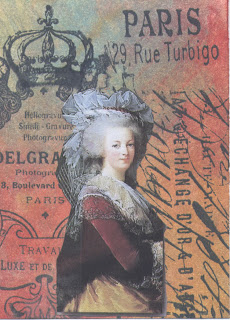
I did not use Dorothy anywhere in the book except the back cover. In AFTCM we have the artistic license to create and interpret the theme in our own way and challenge ourselves, therefore,  I chose to have her missing rather than in a specific place in the Land of OZ.

To be honest, I really waited until I had finished the book before signing up for the swap as I was not sure I could accomplish something that I would feel good about sending to someone. Now it is completed I am happy with it and I enjoyed the journey and the challenge.

Doodles Unleashed Alphabets

On the ArtVentures group I am participating in a Doodles Unleashed Alphabet swap, based on Traci Bautista's style of doodling.

I am not sure I am doing these right as I think I need to be more "free' in creating the letters, but I went ahead with the first four and hope that the other participants won't be disappointed with my efforts.

The A is on a colour wash background and coloured with Tombow markers, B is a Fresco ink background and the letter coloured with Twinkling H2O's, C is a shaving cream marbled background on matte cardstock - the letter coloured with Tombow markers and Galaxy Gel Pens, D is on an acrylic paint background.

A Garden Journey Book

On AFTCM I am participating in a swap where we are making a house shaped book themed " A Garden Journey". A friend on the group was kind enough to send me a template of various shapes for the house and I cut them out on some cardboard.

For the front I printed off a gate on a piece of acetate and cut it to size.

The first page is an picture of a door from my friend Adrienne from her personal collection which she shared on one of our groups. I cut out images from an old calendar which had various garden themes and worked them around the door image. For the peak of the house I chose a butterfly from a brochure - one of my favourite things.


The back of this page was covered with some scrapbook paper and again I used some flowers from the old calendar as well as a magazine page.  The image of the lady is from magicmoonlightfreeimages.blogspot.com. I added a border from an old greeting card at the bottom and the word sticker on the top.
Page 3. I coloured a piece of cardstock with Cathie Allan's Stamp Smoosh technique, and lightly stamped a music stamp all over, cut it out and attached it to the cardboard shape. I stamped and coloured the LaBlanche stamp of the little girl in the daisies, cut it out and added it to the stamped background. To complete the page I added a transparency which I recently bought and a little sunflower button to which I added a punched image and a dewdrop which I coloured with alcohol ink.

The back of this page was covered with scrapbook paper which really is not floral but I thought it would work well with some little dimensional plastic flowers that I had in my stash. I added gems to a couple of the flowers that had holes in the centre.

Page 5, I started by stamping an old favourite PSX stamp of a garden pond scene and coloured it with Lyra coloured pencils. I then added colour to the background with chalks then added stamped trees, rocks and grass. I printed off the bird image which is a freebie from Elizabeth's blog. I then stamped the "welcome" stamp coloured and cut it out and added it at the bottom.

The back of the previous page started off with what my friend Trish B calls "worksheet wonders"; basically a piece of paper that has been under a project while stamping or spraying. In my case this was a piece of cardstock that was under a project that I was spraying with Adirondack color wash. There were a lot of white spaces so I added Ranger distress stain over the whole sheet, which is transparent enough to allow some of the original colours to show through.

I stamped a Judikins Sunflower stamp on the background using distress ink and distress embossing powder.
I printed off a poem and put it under a cute little frame that I bought for a couple of dollars at Michaels. The bird image is a thin sheet of self-adhesive cork precisely laser-cut from Magenta which I coloured with pigment inks. Finally I added a butterfly, a little rainbow and a grass sticker.

Page seven, I covered with a floral themed paper. I had some chipboard pieces left from my Ezee Pzee design kits and decided that the tree would be my centre piece. I coloured it with acrylic paints. I found some apple and squirrel stickers in my stash and added them to the tree. I also had a smaller Magenta cork bird that I had already coloured and added it on one of the branches. The little pink cat was from a stash of embellishments and I thought he/she would be perfect sitting under the tree, perhaps hoping the squirrels would come down?

At the top I added the acrylic daisy and the Escape stickers  to finish off the peak.
The opposite side of page 7 started off with a piece of a brochure with a floral design at the edge. I printed a poem/quote and coloured over it to make it blend into the background, but the edges still showed so I added some sticker borders around it.

The bird image is from Elizabeth's blog and the 3-D bunnies were a gift from my friend Tracy. To complete the peak I cut out a large flower from the old calendar to make it look like a roof. The little bees are from a free sheet of images from vintagepaintworks.com. I am not sure if these are available anymore as I could not find the site when I recently did a search to link to them.
For the back cover I cut a piece of thick vinyl and stamped a saying at the bottom in Stazon ink. I had some wooden bird pieces from Kaisercraft which I painted with acrylic paint and glued to the cover.
This will be on the way to my partner later this week. Hope she likes it as much as I enjoyed making it.

4X4 inchie Quilt

On AFTCM we are doing another 4X4 swap, this time being an inchie quilt block. I tried several different stamps for this but was not happy with any of them.

For the base I took a piece of black cardstock that I had underneath another project while spraying Smooch Spritz and Glimmer Mists, and added some other colours of Smooch Spritz to it. I ran it through the Swiss Dots Cuttlebug folder.

I found some scrapbook paper that Tolegranny sent me which looked like the Tim Holtz alcohol ink Splatter technique. Since it was a thin paper I glued it to a piece of cardstock then punched out the squares with a 1" punch. After attaching them to the background I felt that it still needed something, so I had some stars that came off of a die cut border sitting in a dish. I added one to the centre then sporadically around the squares.

Hope my partner likes my creation.

A-Z techniques Alphabet M

Finished my M for the ArtVentures A-Z techniques. For this month I decided on doing a metallic ink background. I tried doing it with the marbling technique but for some reason the inks kept sinking to the bottom of the pan of water, no matter how full or empty it was. So I reverted to dipping the glossy cardstock in the water and adding inks  while it was wet

To complete the M theme, I used a music stamp on the background and stamped a young boy for masculine and finally added a piece of Mica Tile over the image.


Friday 30 March 2012

Creative Chemistry Day 10

Here we are on day ten and the classes are over. Today we learned about the various dimensional mediums, Stickles, Liquid Pearls, and Sealers. Tim surprised us by actually using a sealer product from a company other than Ranger; Microglaze by Judikins. I have used this product for quite a while and it is fantastic, making the paper waterproof.
The video was fun to watch, as when Tim said he used a product from another company there were a lot of ohs, ahs and noise in the background.

The one and only technique for this class was using Distress Stickles.  A bit of a disappointment that there was only one, but the class was still jam packed with lots of information. I had played with the Distress Stickles in the past and was a bit unhappy with them, but once I watched the video I realized that I had been using them wrong.

After playing with them in the correct manner I am now a happy gal!! I thought I only had one colour but discovered I had three and decided to try them on small scrap pieces of paper prior to doing the tag, so I could see the different effects. I settled on the Milled Lavender as I felt it came out the best.

My background stamp by Stamparosa was not large enough to cover the whole tag so I added some paper lace to the top and bottom. This is a lovely subtle glittery technique and of course does not show in the scan. 


Thursday 29 March 2012

Creative Chemistry day 9

Day nine - only one more day to go and I am feeling a bit like I may go into withdrawals when the class is over.

Today we learned about Perfect Pearls. Tim discussed the properties of the powders and also introduced us to Perfect Pearl Mists and how they react on different papers. He went on to demo techniques using Perfect Pearls Powders with Inks.

The stamp used on my version in the middle is by Stampington and Co.

The techniques Tim taught today were: Perfect Distress Mist, Perfect Distress and Perfect Splatter Distress.


Unfortunately you can't see all the glimmer and shimmer in the pictures, but they are wonderful background techniques. Great "perfect" inky fun!


Corner book marks

On AFTCM we occassionaly do quick swaps along with the regular monthly ones, This time around we are doing corner bookmarks.

 I used a template from http://tallystreasury.com/2011/02/corner-page-bookmarks-3/

I made my bookmarks using scrapbook papers and scraps of cardstock, thus, each one is a bit different. After putting them together I printed off a quote, cut them out and added them to the top of the bookmarks.

Creative Chemistry Day 8

Wow, the time has flown by for this class! Day 8 and learning some great techniques again. This day it was about Paint Primers. Tim discussed various types of paints and their effects then into techniques using Distress Crackle paint.


We used Sticky Back Canvas, tags and chipboard (or grungeboard) pieces for the three different techniques.

I used stamps form Comotion, Lost and Found and PSX; the chipboard piece is by a company in my area -Ezee Pzee.
 
I must admit that the tag I am most pleased with is the first one with the feather on it. The middle one, I think I should have chosen different stamps and on the chipboard, perhaps should have used more of the medium.  However, as these will be in my binder  for the class they will be references for the techniques which I can play with more and improve upon. Practice makes perfect!
 

Creative Chemistry Day 7

Day seven is about Embossing Basics. Tim covered techniques on embossing with Distress Inks and Powders and discussed various embossable inks and powders.
Although I am familiar with the types of inks used for this purpose, I still learned a number of things about the different properties of the supplies.

Again, some of my colour choices in the supplies are limited but it did not stop me from being able to try the techniques.

I used stamps by All Night Media, Magenta and Hero Arts,

The techniques we were to try are: Nostalgic Batik, Rusted Enamel and Distress Powder Resist. Great fun revisiting the first technique which I have done numerous times, and enjoyed the other two which I have not done before.